When Pete Buttigieg and Amy Klobuchar dropped out of the Democratic Presidential Primary the days before Super Tuesday, many of their supporters flocked to now heavy frontrunner Joe Biden. It was what more moderate Democrats had been claiming for months. If the moderate wing of the Democratic party could consolidate around a single candidate, that candidate would win the primary election. For months, the moderate lane had been too crowded.
The concept of primary lanes has been floated around throughout the Democratic primary. A lane is a chunk of the party that candidates compete to capture. This chunk is most often ideological. For example, Elizabeth Warren and Bernie Sanders were thought to have shared the Progressive Lane, while Biden, Buttigieg, and Klobuchar shared the Moderate Lane. However, lanes could be due to having a similar background or a similar target demographic. These lanes are harder to detect.
After hearing a talk given by RStudio Data Scientist Julia Silge about word vectors, I wondering if I could connect Democratic candidates through the words they used. Though I’m no expert in text data analysis, the analysis I performed provided interesting insights on Democratic primary lanes and may serve as a starting point for others interested in text data analysis or looking back at the primary.
Kaggle currently hosts a data set with all the text from the Democratic primary debates, taken from rev.com.
The data set contains the text for the entire debate, including the moderators. Because we are only interested in the candidates, the first step of cleaning the data set is to filter down to the rows that were spoken by a candidate. From there, we will break down each speech to individual words and get rid of any words that were rarely used.
candidates <- c("Elizabeth Warren", "Bernie Sanders", "Joe Biden", "Pete Buttigieg", "Amy Klobuchar", "Tom Steyer", "Cory Booker", "Kamala Harris", "Beto O'Rourke", "Tulsi Gabbard", "Andrew Yang", "Julian Castro", "Bill de Blasio", "John Delaney", "Michael Bloomberg", "Kirsten Gillibrand", "Marianne Williamson", "Jay Inslee", "Tim Ryan")

tidy_debate <- debate %>% filter(speaker %in% candidates) %>%
  select(speaker, speech) %>%
  unnest_tokens(word, speech) %>%
  group_by(word) %>%
  filter(n() >= 20) %>%
  ungroup()
From there, I removed any stop words (the, and, is, etc.) since those common words don’t reval anything interesting about a candidate. I then counted the number of times each candidate said each word and spread out the candidates as columns of a tibble.
data(stop_words)

debate_mat <- tidy_debate %>% filter(is.na(as.numeric(word))) %>%
  filter(!(word %in% stop_words$word)) %>%
  count(speaker, word) %>%
  select(speaker, word, n) %>%
  pivot_wider(word, names_from = speaker, values_from = n)

debate_mat_clean <- as.matrix(debate_mat[,-1])
debate_mat_clean[is.na(debate_mat_clean)] <- 0
rownames(debate_mat_clean) <- debate_mat$word
With the data organized like this, it was an easy task to create a correlation matrix and heatmap that found the correlation between the word counts of all candidates. The code to generate this heatmap was taken and modified from a tutorial at http://www.sthda.com/english/wiki/ggplot2-quick-correlation-matrix-heatmap-r-software-and-data-visualization.
Code for creating heatmap
cormat <- (cor(debate_mat_clean))
get_upper_tri <- function(cormat){
cormat[lower.tri(cormat)]<- NA
cormat
}
reorder_cormat <- function(cormat){
# Use correlation between variables as distance
dd <- as.dist((1-cormat)/2)
hc <- hclust(dd)
cormat <-cormat[hc$order, hc$order]
}
cormat <- reorder_cormat(cormat)
upper_tri <- get_upper_tri(cormat)
# Melt the correlation matrix
melted_cormat <- melt(upper_tri, na.rm = TRUE)
# Create a ggheatmap
ggheatmap <- ggplot(melted_cormat, aes(Var2, Var1, fill = value))+
geom_tile(color = "white")+
scale_fill_gradient2(low = "blue", high = "red", mid = "white", midpoint = .5, limit = c(.01,.99), space = "Lab", name="Debate Similarity") +
theme_minimal()+ # minimal theme
theme(axis.text.x = element_text(angle = 45, vjust = 1,
hjust = 1))+ coord_fixed()
ggheatmap +
geom_text(aes(Var2, Var1, label = round(value,2)), color = "black", size = 2) +
theme(
axis.title.x = element_blank(),
axis.title.y = element_blank(),
panel.grid.major = element_blank(),
panel.border = element_blank(),
panel.background = element_blank(),
axis.ticks = element_blank(),
legend.justification = c(1, 0),
legend.position = c(0.6, 0.7),
legend.direction = "horizontal")+
guides(fill = guide_colorbar(barwidth = 7, barheight = 1, title.position = "top", title.hjust = 0.5)) +
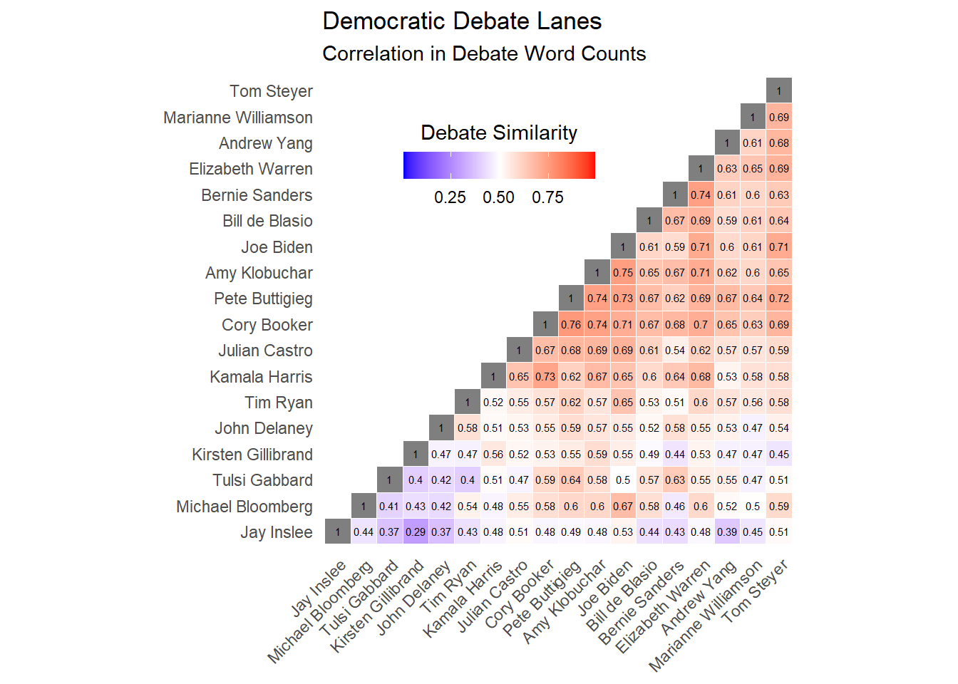
labs(title = "Democratic Debate Lanes", subtitle = "Correlation in Debate Word Counts")Candidates that have more correlated word counts may have similar rhetoric, similar important issues, or a similar background. I propose that this makes it likely that they share a lane.
The heatmap detects the moderate and progressive lanes, with the word counts Biden, Buttigieg, and Klobuchar all highly correlated, and the word counts of Sanders and Warren also highly correlated.
However, just as interesting are other pairs of candiates that may have shared a lane without people noticing
- Cory Booker and Pete Buttigieg: The “young and cool” lane (\(\rho\) = .76)
Many college students flocked to the progressive policies of Sanders and Warren, but others chose to support Booker or Buttigeig. Both of these candidates had a positive energy among younger people, likely due to their own age and excitement.
- Cory Booker and Kamala Harris: The “Obama/Biden” lane (\(\rho\) = .73)
When Barack Obama won the 2008 election, he did so with tremendous support of young voters and African American voters. Both Booker and Harris tried to connect to these voting blocks to build their coalition, but unfortunately for them, most of these voters chose to stay with Biden.
- Joe Biden and Michael Bloomberg: The “Electable” lane (\(\rho\) = .67)
Bloomberg ran a very different type of campaign and only appeared in two debates. However, the candidate to whom he was most similar was Joe Biden. Both candidates were older white males, had the support of much of the party establishment, and ran on a somewhat moderate/centrist/“back to normal” platform. When Biden’s support grew days before Super Tuesday, that spelled the end for Bloomberg’s campaign.
Other possible observations:
The candidates who at one point tried to pose themselves as a candidate the entire party could get around (Booker, Buttigieg, Biden, Warren) had higher correlations with other candidates than candidates who framed themselves as outsiders (Sanders, Tulsi Gabbard).
Of the candidates who garnered the most support, the most distinct were Biden and Sanders (\(\rho\) = .59). The two ran vastly different campaigns and had different bases, which may be the reason they ended up as the final two candidates.
The two least similar candidates were Jay Inslee and Kirsten Gillibrand. This is possibly becuase neither lasted very long on the campaign trail and both are mostly known for their work on single issue (climate change and women’s rights, respectively).
This analysis was relatively simple, but had compelling results. I look forward to doing similar analyses on other texts to see if it is generalizeable to other fields.